The Distant Daily

I’ve been close friends with Meagan Long, founder of Goteya, for the past thirteen years. In that time we have lived far and further apart.

Due to the Covid-19 pandemic that is turning the world upside down, both of us find ourselves in our respective corners of the world - from Brooklyn, NY to my small village in Luxembourg, simultaneously sheltering in place and social distancing to help prevent the spread of infection.

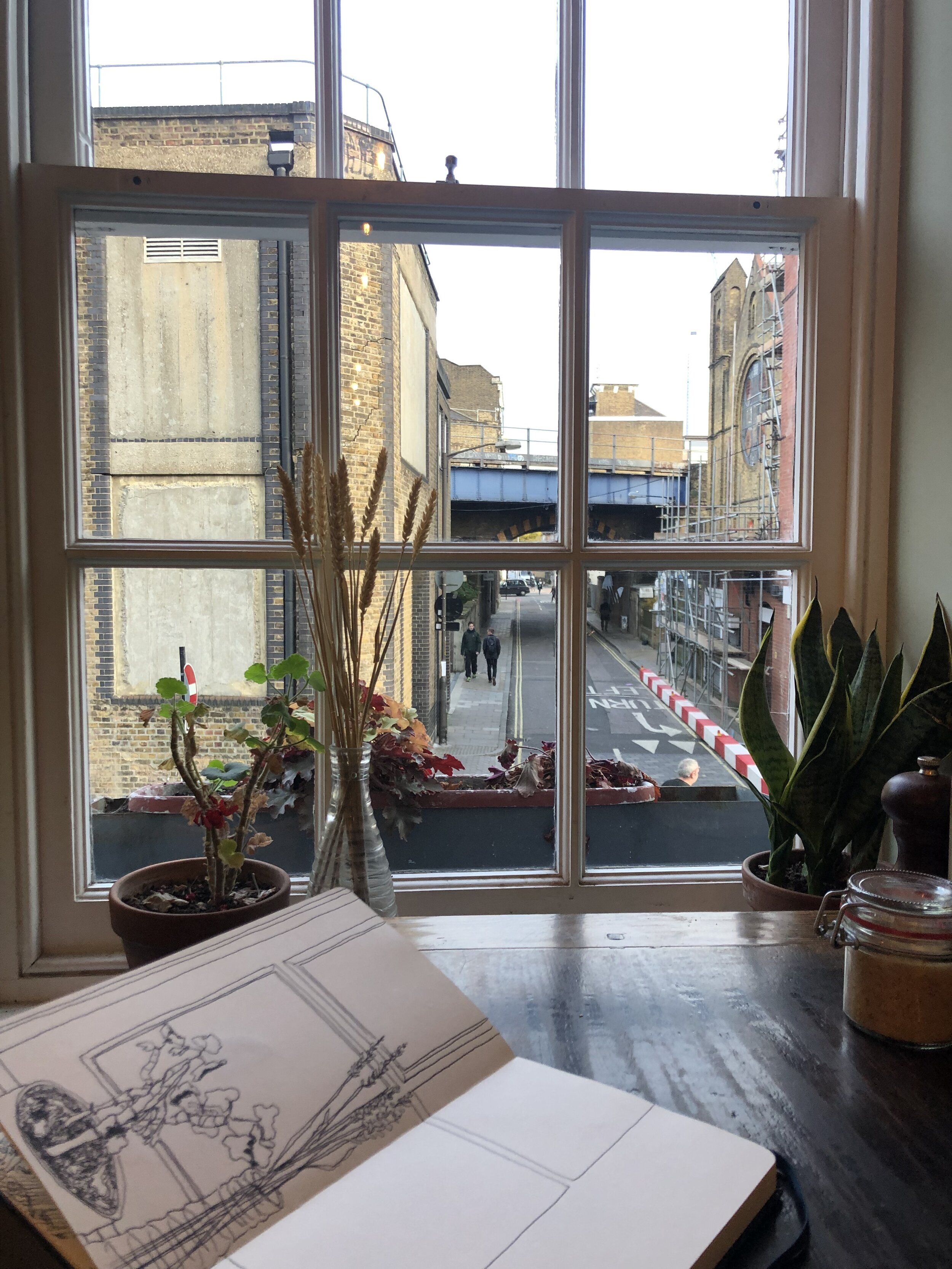
Day 1: Reading on the fire escape in the sun: a postcard never sent / New blooms shaped like violet tears at 5:30 pm

In an effort to chronicle our similar, yet different lives in lockdown, we’ve started a collaborative project called The Distant Daily. It is both a gesture between friends to remind each other that we are alone together as well a way to let imagery communicate the words we are still trying to form.

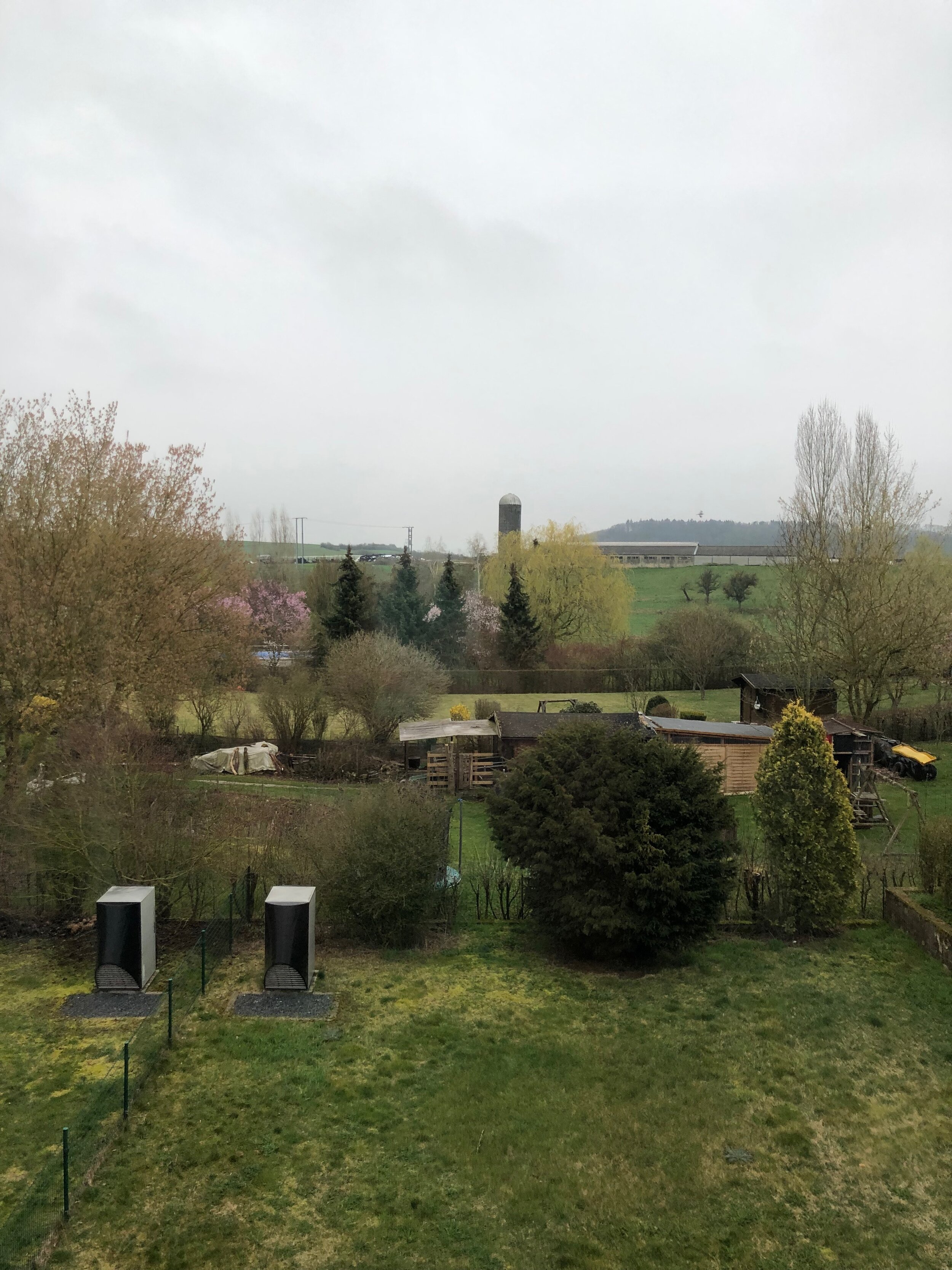
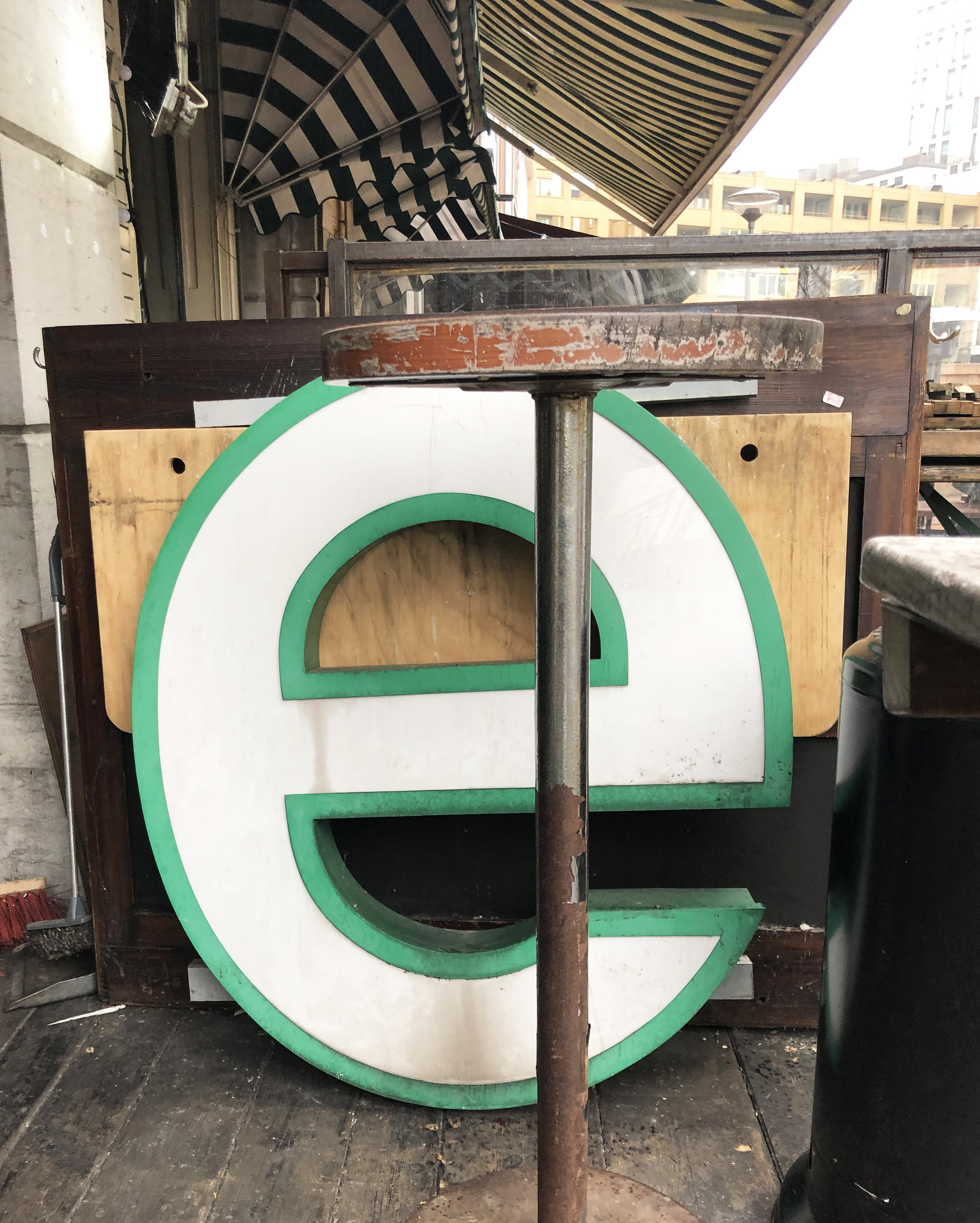
Day 2: A deserted highway with one shop open / The relief of an unexpected sign to stop you from crying

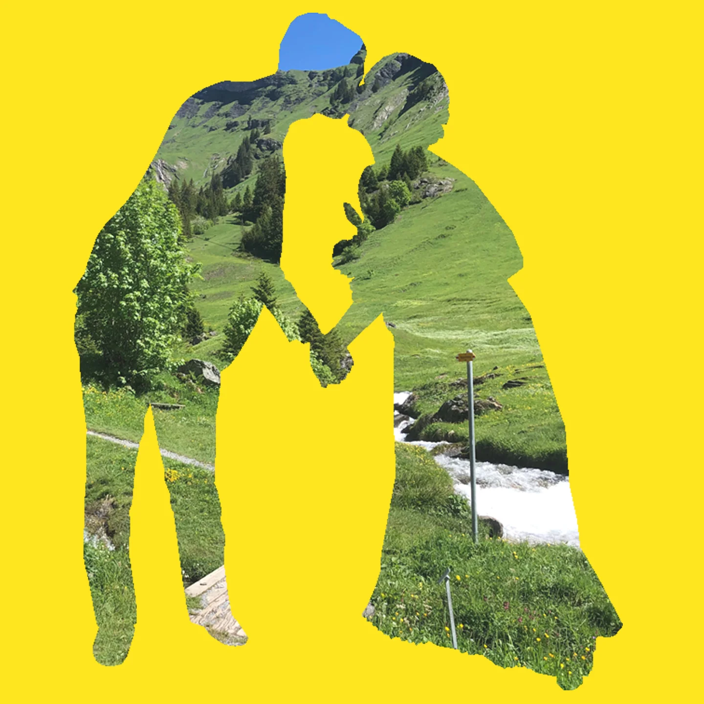
The Distant Daily takes the simple act of sharing one photo a day and exposes a complicated composite of emotions and poetic metaphors unveiled in our pairings. Signs formed in hay vs those still flashing in neon shift to symbols in shadows or blooms of hope shaped like tears.

Day 3: A once thriving industrial park in Bush Terminal, Brooklyn / New Rituals

Taking photos is how we are learning to cope and connect while adjusting to these new surreal realities.

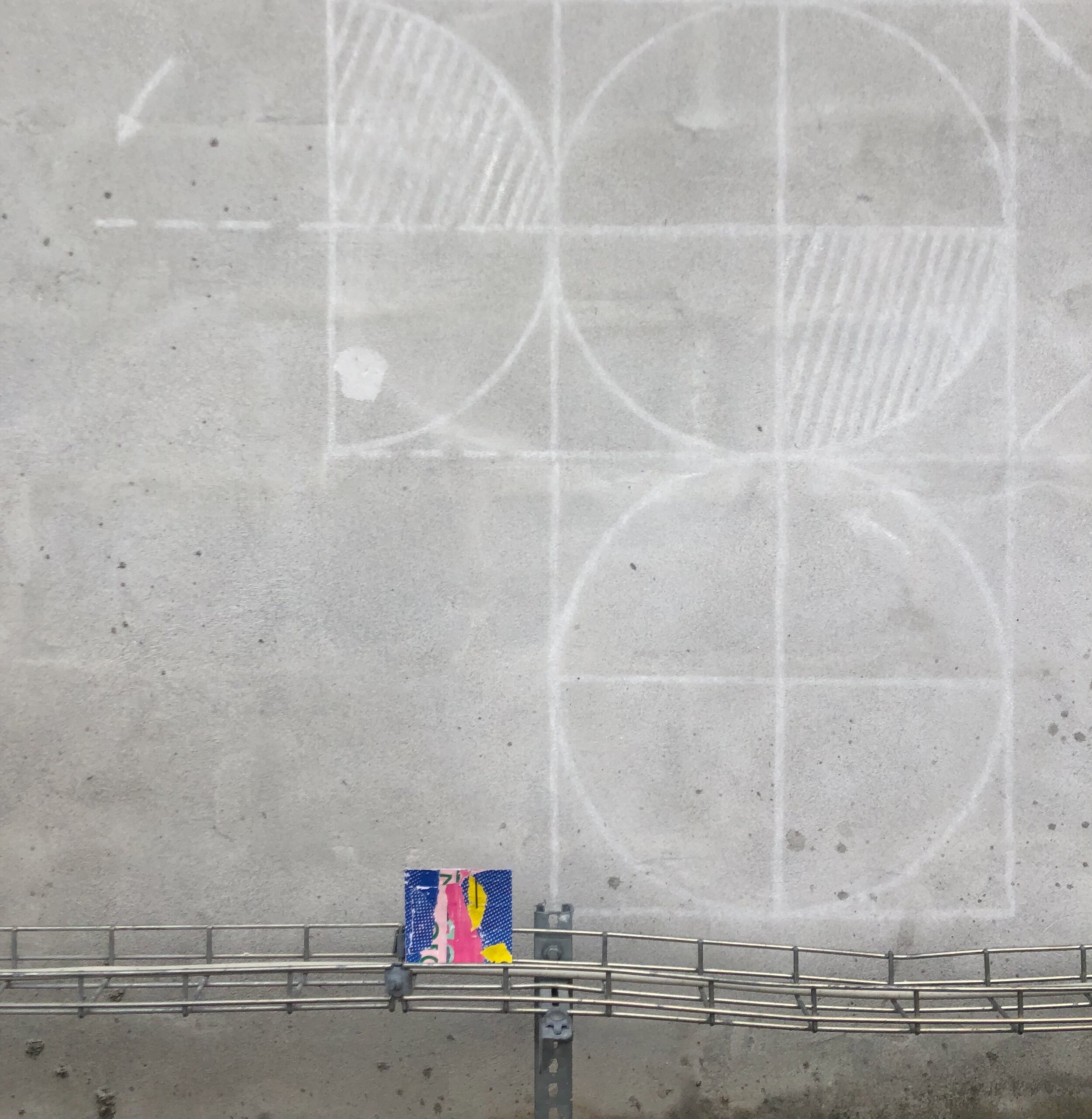
Day 4: Industrial seascape / A hoop without a net, but a shadow for a friend

While we are all trying to weather our new storms, here is a non exhaustive list of additional creative responses & resources for you during this crisis:

What is helping you?

Mapping Messes

Daniel Spoerri is a Swiss artist and writer born in Romania in 1930. He is most well known for his “snare-pictures” and corresponding book, “The Anecdoted Topography of Chance.”

anecdoted.jpg

I interpret Spoerri’s snare-pictures as a game of creating maps that simultaneously avoid cleaning. However, his definition is a depiction of objects found in chance positions at a particular time and in a particular location, fixed in place either through assemblage or drawn diagrams.

An Anecdoted Topography of Chance, Page 241: FOLDOUT, Daniel Spoerri, Cubist View of My Room, No 13, Hotel Carcassonne, at 24 rue Mouffetard, Paris 5éme, taken according to my instructions by Vera Mertz Spoerri in 55 individual photographs and mount…

An Anecdoted Topography of Chance, Page 241: FOLDOUT, Daniel Spoerri, Cubist View of My Room, No 13, Hotel Carcassonne, at 24 rue Mouffetard, Paris 5éme, taken according to my instructions by Vera Mertz Spoerri in 55 individual photographs and mounted on plywood, 189 by 88 cm, 1961

“In my room, No. 13 on the fifth floor of the Hotel Carcassonne at 24 Rue Mouffetard, to the right of the entrance door, between the stove and the sink stands a table…I have set out to see what the objects on a section of table might suggest to me, what they might spontenously awaken in me in describing them: the way SHERLOCK HOLMES, starting out with a single object, could solve a crime or historians, after centuries, were able to reconstitute a whole epoch from the famous fixation in history, Pompeii.”

-Daniel Spoerri, 1962 from An Anecdoted Topography of Chance, p. 23

“…his original idea, to trap reality in a snare. To pin it, stuffed to the wall of blank page…He was concerned above all with exhausting the potential descriptions of a Parisian scene at a particular moment in time.” - Roland Topor

An Anecdoted Typography of Chance, page 148-149 (Object 46: Greenish Bakelite ashtray - Object 46a: Burnt match in ashtray

In my version, the updated 1966 publication of Spoerri’s “An Anecdoted Typography of Chance,” co-written by Spoerri and his friends - the book is classified as an “artist book, a novel of digressions, a rambling conversation, a game, an encyclopedia, a cabinet of wonders and even a celebration of friendship and creativity.”

The book meticulously notes every object depicted in the Topographical Map of Chance, 17 October 1961, snare-picture and records each object’s evoked associations, memories and anecdotes.

An Anecdoted Typography of Chance, page 149: 46a: Burnt Match

Partly influenced by the multi-faceted recordings of “symbols as old discarded stuff,” and my own reflections on the current state of my house, I began outlining my collection of domestic battles with never ending mess.

A Collection of Little & Rather Big Messes (Did they clean themselves, we’ll never know) in a mini pink &Luxembourg notebook, designed by Isabelle Mattern

Fed up with my cyclical chores, I went from room to room, surface to surface, documenting the various: piles, stacks, mountains, lumps, bumps, towers, and labyrinths of mazes in and around my home.

37 Objects on the Dining Room Table, 2020

When I think about how objects I choose to live with paint a type of portrait with the meaning and symbolism I’ve projected on them, I start to see a different kind of narrative within the chaos of my mess.

On my studio table, I see evidence of the creative process, forgotten cold tea included.

My messes reflect the relationship of my things to my environment, like my pile of clothes burying my window sill, with folds, mimicking the very shapes and forms within the landscape seen from the window behind it.

19 objects on my window sill

19 objects on my window sill

In the same vein, overlapping messes of a shared meal, the leftover dirty dishes reveal a type of exchange akin to a conversation, like the the way two different people inhabit and utilize objects in shared spaces, but in this case, the privacy of the home.

Beginning of the week vs end of the week.

In MacGuffin Magazine, Issue No. 5, critic, Sam Jacob contributes an essay, Life Among Things.

“Jump cut to the very room you are in and look at all the stuff around you. Can you explain all this stuff? What it’s doing there? Why you have it? Why you keep it? How could we begin to describe our life with objects?

-Sam Jacob, “Life Among Things,” an essay to accompany the exhibition, “Finders Keepers” at the Het Nieuwe Instituut in Rotterdam

In fiction, a MacGuffin (sometimes McGuffin) is an object, device, or event that is necessary to the plot and the motivation of the characters, but insignificant, unimportant, or irrelevant in itself. (From Wikipedia)

In fiction, a MacGuffin (sometimes McGuffin) is an object, device, or event that is necessary to the plot and the motivation of the characters, but insignificant, unimportant, or irrelevant in itself. (From Wikipedia)

What most snare-pictures don’t reveal, are the hidden objects, tucked away in cabinets and drawers. Think of all the junk drawers, the stuff we don’t want to clutter our counters, the many secrets we hide from ourselves and others.

Even Walter Benjamin, who famously wrote the classic essay, “The Work of Art in the Age of Its Technological Reproducibility,” (1935-1936), writes of cabinets as mirrors of our culture, both ‘veil’ and ‘what is veiled’, in his autobiography, “Berlin Childhood Around 1900.”

Kirsten Algera and Ernst van der Hoeven, editors of MacGuffin Magazine, describe “Benjamin’s cabinet odyssey” as exhibiting the same characteristics of what make cabinets interesting: to show, hide, and keep things.

Saving Seats & Storing Secrets, was a stacked sculpture created from a former rejected cabinet. Never exhibited publicly, it was built to demonstrate objects as carriers of memory, serving as boundary markers for the symbolic configurations known as home - a former snare-picture of sorts.


What do you show, hide & keep?

The Way I've Learned to Travel

I’ve always been encouraged to explore. In my family, if you have an opportunity to travel, you take it, regardless of the consequences.

Made it to Paris despite a nationwide strike

This year I have traveled to eleven countries.  After making every mistake, including turmeric spice exploding in my luggage, I have now perfected the art of packing a bag.

Whether it is a solo journey, a really long drive with a gassy pup, or hopping from train to bus, helping my mom with her oversized luggage - some things I have learned that have helped me get better at traveling are:

list 1 copy.jpg

Pack only the essentials.

I try to take only the things I know I will need. For me packing gum, water, a snack (usually something salty), and dizziness medication can make or break a trip.

My motion sickness survival kit, (most of the time I carry a reusable water bottle, but this plastic bottle was more interesting to draw)

My personal never-leave-home-without item is my moleskin sketchbook, accompanied by one or two pens, and an extra tote (just in case). And if I can, I will add a book and my polaroid camera.

What you will always find in my bag, but the books get switched out periodically

Research in advance as much as you can, but don’t be too hard on yourself when you get it wrong. The truth is you can always buy a new sweater when you are freezing or new shoes when you have to walk 10+ miles (16 km) because the metro is closed due to a strike.

Just don’t forget to laugh when your friend convinces you to go with her to a club in Düsseldorf and all you have to wear is a turtle neck and an overall jumper.

list 2 copy.jpg

Decide what your priorities are.

My priorities range depending on the type of travel. If I am in London on a research trip, I plan out in advance which exhibitions I want to see the most and where the museums and galleries are located in proximity to one another.

I like to visit museums like the Victoria & Albert, not only for their mesmerizing exhibitions like, Tim Walker: Wonderful Things, but also for practicality.

Museums are my solution to when it is cold and wet outside or if you have a few extra hours before you can check in to wherever it is you are staying. The bonus is that if your bag is small enough, you can shed it and your extra layers at coat check for a small fee of 1£.

It is good to come to terms with the fact that you will not and can not see everything before you arrive. Places like London have endless galleries and museums. I had to decide what was most important for my research.

Seeing Mark Bradford’s solo exhibition, “Cerberus,” at Hauser & Wirth was a gift of inspiration that I am still revisiting in my head. It was the type of experience that can make an entire journey worth the effort.

Part of prioritizing is paying attention to your budget. For most places I have traveled in Europe, museums can average 10- 20 euros for an adult ticket. Many times I’ve had to skip the fancy dinners and opt for cooking the same cheap and boring meals to afford the museums.

Lucky for me, one of my favorite museums, the Tate Modern is free (minus special exhibitions).

If you aren’t traveling solo, be mindful of who you are traveling with and be courteous of their needs too. If I am traveling to visit friends and their baby, decisions are made around nap time.

IMG_8862 2.jpg

If you are traveling with your mom, walk slowly and hold the umbrella when it rains. Laugh with her when you stand too close to the street and a car drives by, splashing a puddle over your heads.

list 3 copy.jpg

Detour when needed.

Even though I just said it is good to plan & prioritize, I think it is just as important to ditch the plan and leave room for the unknown. If you see something that you find interesting, stop and investigate.

Golden Light, London

Mindfulness is eyes wide open.

“Go outside into the world and be mindful of what you see…practice listening to sounds, looking up to the sky and down to the ground, and zooming in on things you would not see otherwise.”

-Lisa Congdon, Find Your Artistic Voice

Whether I am in London or anywhere for that matter, I tend to navigate towards the bright colors - old things made new.

If you pay close enough attention, sometimes you encounter signs that signal more than just what is visible on the surface - little reminders of why you came to find yourself in that spot - like the sweet encouragement of a smiling blue bird, when you are feeling lost.

list 4 copy.jpg

Make safe choices.

This one seems obvious, but more times than not I have gotten myself into tricky situations by making poor judgements. After getting lost in Tel Aviv with little cash and no phone, I always travel with a spare charger and spare change hidden inconspicuously.

In general, be aware of your surroundings and trust your instincts, especially if you are a woman traveling alone.

Beach Patterns, Tel Aviv

Luckily, I was able to retrace my steps, following the coast with a collection of landmarks and the help of a kind taxi driver that accepted to take me as far and as close to the beach as my limited funds would afford.

Sea Glass, Tel Aviv

In the end I learned my lesson and traded bread crumbs for sea glass, finding my way back again.

list 5.jpg

Recharge

Don’t forget self care.

Piazza San Marco, the most expensive place to drink a cappuccino

Sometimes I get caught up in the adrenalin of a new place and I have to remind myself to hydrate, stop and eat regularly, not just caffeine & sugar.

But if you are in Vienna aka the land of sweets, you must try the cake.

list 6.jpg

Document

Record your adventures.

My grandad and now my dad, travel everywhere with their video cameras. I appreciate the opportunity to go back in time through their eyes.

From the home video collection: Grandad’s musical montage of traveling in Europe with family commentary as an added bonus

I like to take pictures and write about what I couldn’t capture in film. I record the names of the restaurants, parks, shops - listing the places that stood out to me or the shape of the clouds in the sky.

If time allows, I like to draw, capturing my squiggly interpretation of the details within my view.

I also keep unexpected souvenirs: an emptied mini jar of jelly refilled with sand, vintage tin cans, a box of purple matches, a ball of thread, striped rocks, a piece of a broken roof tile, found wood shaped like a wishbone, beach plastic or stolen spoons.

A collection of souvenirs

(EDIT: Recommended read - additional insightful considerations for travel,“Should There be a Universal ‘Code of Conduct’ for Travelers?” written by Sally Kohn.)

A Year of Sunrises

A collection of seasons and their sunrise.

Nov 18th 2018 713 copy.jpg

Nov 18th 2018 7:13 am

Nov 23rd 2018 810 am.jpg

Nov 23rd 2018 8:10 am

Nov 29th 2018 8 am .jpg

Nov 29th 2018 8 am

March 6th 649 copy.jpg

March 6th 2019 6:49 am

Sept 16th 654 copy.jpg

Sept 16th 2019 6:54 am

Oct 30th 715 copy.jpg

Oct 30th 2019 7:15 am

oct 31st 711.jpg

Oct 31st 2019 7:11 am

Screen Shot 2019-11-10 at 10.27.26 AM copy.jpg

Everyday I wake up to the rolling hills of a farm behind my house slowly creeping into view, admiring the sky’s ever changing blue.

“The world is blue at its edges and in its depths…

For many years, I have been moved by the blue at the far edge of what can be seen, that color of horizons, of remote mountain ranges, of anything far away. The color of that distance is the color of an emotion, the color of solitude and of desire, the color of there seen from here, the color of where you are not. And the color of where you can never go. For the blue is not in the place those miles away at the horizon, but in the atmospheric distance between you and the mountains.”

-Rebecca Solnit, A Field Guide to Getting Lost

dream.jpg

Sometimes dreams come true.

Copenhagen: A Field Study

The last time I created a field study notebook was in undergrad at UNCC. I had taken art history classes in NYC and London and the final assignments were detailed notebooks of your findings.

Side note: I fell in love with the work of artist Storm Tharp (flyer pictured above), who is based in Portland, Oregon. It began my curiosity of the Pacific Northwest, where I eventually lived for six years.

In theory, the idea of continuing to chronicle my travels post graduation was always a goal, but unfortunately, the reality has been that the project always got buried in my to do list.

It wasn’t until recently that I was inspired to revisit the idea after learning of the late Danish artist, Per Kirkeby. Currently, on exhibit at the Statens Museum for Kunst, are his series of collages from his project Field Books.

As a trained geologist and artist, he would travel with a notebook, using a variety of media to sketch his observations. For Kirkeby, his diverse subject matter was often themes such as architecture, trees, drawing techniques, erotic motifs or maps.

I started by creating collages on the go. I made a sight specific series of scavenged squares in different scenarios.

Each location is part of a collection of observations bound in a little pink book.

#1: Nyhavn Townhouses

#2: Parks, Gardens & Cemeteries

Superkilin Park (designed by Superflex), The King’s Garden, Assistens Cemetary & Frederiksberg Park

#3: Svanemølle Beach & Torvehallerne Market

#4: Louisiana Museum of Modern Art

The Louisiana Museum of Modern Art is named after a man with three wives, all of them named Louise.

#5: SMK Museum - Asking important questions

#6: Galleries: V1, Gether Contemporary, & Bo Bjerggaard featuring favorite find - Peter Linde Busk

#7: Coco the Cat in Copenhagen

Stayed at an Airbnb with a cat named Coco.

#8: Design Museum

#10. Rundetaarn (The Round Tower)

Europe’s oldest Observatory

May You Live in Interesting Times

The floating city of Venice, Italy is a living museum of found paintings.

A Collection of Walls Found in Venice, Italy, September 2019

I found the walls in Venice to sit proudly in elegant decay, wearing their histories in the patina and faded colors of peeling and chipped paint with poignant adversity.

The resulting textures mark the passage of time and the effects of an incessant number of tourists and the dangerous rising water of the Adriatic Sea’s high tide.

Out of one of the few newspapers I found written in both Italian and English, I read an article, “Venice 2019 Annual Report,” by Gherardo Ortalli, reporting that per one Venetian resident there are 358 tourists, myself included.

Like many other tourists, my reason for visiting was to see the Venice Biennale, aka the Olympics of art. Held biannually in odd numbered years, La Biennale Di Venezia dates back to 1895. Now in 2019, this contemporary art exhibition features a continually growing number of international artists, with more countries installing their own national pavilions.

At the 58th National Art Exhibition (11 May - 24 November 2019), titled, “May You Live in Interesting Times,” I noticed a theme of responses to both climate change and migration.

El Anatsui, is one of six featured artists housed in the Artiglierie section of the Arsenale at the Ghana Pavilion.

Well known for his shapeshifting tapestries of smashed bottle-caps and other recycled detritus, Anatsui’s largest piece featured at the pavilion is a vivid yellow, larger-than-the-wall piece, that references the damage gold panning has wrought on Ghana’s rivers.

Throughout Anatsui’s work there is a clever multi-faceted use of material that simultaneously comments on reclaiming discarded goods out of necessity while referencing both political and historical concerns.

Even his use of cropped text from salvaged aluminum, cites Nigerian liquor companies and alludes to the dark history of Colonialism within the production of rum.

The theme of climate change was addressed directly at the Nordic Pavilion’s exhibition, “Weather Report: Forecasting Future.” Featured above is the work of the artist collective, Nabbteeri, and Ingela Ihrman.

“ It is often difficult for humans to notice life that exists on a scale different from theirs, such as microscopic organisms, the slow workings of toxic agents or durational processes of decaying organic matter. The exhibition attempts to establish a connection with more-than-human agencies by heightening the visitors’ awareness of the materiality, including that of the space and the artworks, and by assimilating their bodies to other life forms.

-Curatorial Statement by Leevi Haapala & Pila Oksanen

Artist, Laure Prouvost featured at the French Pavilion, presented “Deep See Blue Surrounding You / Vois Ce Bleu Profond Te Fondre,” as what I interpreted as a response to the location of Venice as a floating city, surrounded by water.

The exhibition requires you to enter from the basement at the back of the building, leading you up a staircase to a brightly lit room filled with glass imitations of trash imbedded into the sea-like floor. In my book, Prouvost won the award for creating the most encapsulating multi-sensory environment filled with surreal immersions of projected moving images and sounds.

“Written in Water,” by Marco Godinho at the Luxembourg Pavilion also comments on the theme of water and man’s use of the sea to migrate.

Seascapes become mindscapes, metaphors and memories of journeys both traveled and not.

Christoph Büchel’s Barca Nostra at the Venice Biennale

Controversially addressing migration via sea, is Swiss artist, Christoph Büchel’s project “Barca Nostra,” featuring the shipping vessel that sunk in 2015 while carrying hundreds of people fleeing Libya to Italy.

The choice to display the boat as part of the Biennale has been criticized on a spectrum of grossly insensitive to “a sign of signs.” British art critic Matthew Collings explained in the Evening Standard, that the boat’s presence is a symbol of privileged exploits and the continually increasing migrant crisis.

“Venice is replete with visible reminders of militarism, colonialism and looting. The Arsenale is where Venice’s coast guard is based. One of their tasks is to keep migrants out.

Found at the off sight exhibition, “Personal Structures,” Federico Uribe, transforms two entire rooms with his installation, “Plastic Reef.” It’s purpose is obvious, but the sheer amount of tiny bits of plastic texture still manages to surprise you.

The only thing not surprising was encountered this exhibition at the same time as a class of lower school students.

Otobong Nkanga at the Giardini

Otobong Nkanga is one of my favorite finds at the Giardini.

“She describes her drawings as coming from a place of imagination; where realities that are happening in multiple places can intersect. Yet, while her approach may be imaginative, her subjects also reference the very real (and often violent) movement and exchange of minerals, energy, goods and people. They are a reminder that objects and actions do not exist in isolation: there is always a connection, always an impact.”

-Curatorial Statement from the Giardini

Not all of these profiled pieces are works that I enjoyed, but after experiencing them at the Biennale, I’m still thinking about them now.

And I hope that today, as people around the world participate in youth led protests against climate change, that you will also think about your part in what you can do to help.

Places Where Two Ends Meet

Corners are a spectrum of dichotomies. They exist in the crossroads and the pull of two places; forming the transitional space where decisions are made.

Kayaking between two countries, counting the bridges that connect them, 2019

As physical markers for navigation, corners represent the end and the beginning. Like chapters with sharp edges, filled with folded creases, bookmarking pivotal passages. Corners have two sides - life achievements and tragic disappointments.

Corners converge in physical and metaphorical space. Manipulated in everyday language, they become nouns, adjectives and verbs that turn phrases into different meanings. Backed into a corner, you can find yourself confronting your worst fears, trapped, with no way out.

But around the corner, you might find a safe space or a secret in the corner of your eye; a quiet nook built with dreams. Turning corners is the possibility of confronting either, while cutting corners are the risks we take to get there.

For me, my studio corner exemplifies the creative struggle, a place where every type of corner is possible.

The Creative Struggle is a Maze of Corners, 2019

Changing Landscapes

We aren’t the same people we were when we first started dating.

The changing landscapes we have experienced together have shaped us into better versions of ourselves.

Double Exposure Porch Portrait, Digital Collage, 2019

Sometimes I wonder if the younger me would even recognize who I am now, but I think a part of me always knew these aspects of myself I needed to see.

My Body, My Home, Digital Collage, 2019

“…Sometimes my own body seems like a home through which successive people have passed like tenants, leaving behind memories, habits, scars, skills and other souvenirs.”

-Rebecca Solnit, A Field Guide to Getting Lost

Looking Within, Digital Collage, 2019

“Home, I said.

 In every language there is a word for it.

 In the body itself, climbing

 those walls of white thunder, past those green

 temples, there is also

 a word for it.

 I said, home.”

- Mary Oliver, “The River”

Searching the Sea for Secrets, Digital Collage, 2019

Its a strange feeling to split your heart and home into multiple places and feel the distance between them.

Yet, its because of that distance that I’ve been forced to grow. Sometimes it is ugly, lonely and depressing. And sometimes it is a gift, like the surreal feeling of being dwarfed by mountains or a never ending sea; to lose count of the gradients of green swatches that run off, winding around a curve.

The Green Places I’ve Lived, Digital Collage, 2019

As I’ve learned the effects of different environments on my psyche, I’ve found its greenery that rejuvenates my soul.

Switzerland’s mountains and lakes reminded me of how much I loved living in the Pacific Northwest, near water and forever chasing a clear view of the iconic Mount Rainier, Washington’s active volcano standing majestically 14,410 feet above sea level.

What places have changed you?

Painting with Words

I’ve always been interested in typography and admire the art of arranging and designing letters.

A combination of three dimensional letters and flat graffiti against a tile grid

It wasn’t until I heard the phrase, “typography is painting with words,” on Netflix’s episode six of the documentary, The Art of Design , that I began to identify why I like to collect found type.

Graphic designer, Paula Scher’s definition of typography is her passion. She is literally a painter of words and in some round about ways, so am I.

Throughout the episode, Scher discusses why she has made a career in “making type talk.” She explains the differences in weights and heights and the power of these measurements to link a letter to a specific time period.

The different impact of letters

She cites the height of the middle bar of the letter “E” as an example. If the middle bar is raised, it is a reference to Art Deco design of the 1930s.

Found upside down type at Naschmarkt, Vienna

Found upside down type at Naschmarkt, Vienna

In my thirty minute introduction to Scher’s work, I came to understand her design to be driven by the challenge of creating letters that are paired with meaning to create an impact in real life.

German type

My challenge with the letters that I find in real life places like Vienna, Paris, Rotterdam or Tel Aviv, is that I cannot read German, Hebrew or Dutch and unfortunately my French comprehension is so minimal, that I am nervous about my final exam.

This means more times than not, I am relying on the quality of design to provide information regardless of my language barrier. Out of necessity, I am studying font for it’s characteristics. I pick up advertisements and stop to take a photograph for the same reason. I respond to which type talks to me in my visual language.

Take the company Meubert for example. I am drawn to their retro packaging, yet it gives me no clues as to what the product is.

Comparisons

Most of the time it is a shape or form, sometimes it is color, texture or the latter that catches my attention.

Good design can make me be that weird person that gets stared at for taking a picture of an everyday, seemingly unimportant sign or tearing advertisements off a pole and stuffing them in my bag.

Oddly enough, while I was wondering through Vienna a few months back, already in the midst of collecting found type, I stumbled upon an exhibition at Georg Kargl Fine Arts, focused specifically on typography.

Lutte Poétique by the late Henri Chopin featured a series of abstract works on paper created with type as the primary medium and subject.

Chopin’s typewritten arrangements use letters, characters and numbers formed in a nonsensical system. When linked together within layers of repetition, they create a different kind of language, legible only in a visual sense.

This is a concept, I have recently been exploring in my own work. As a way to help me process the overwhelming feeling of working through language barriers, I have begun to exploit these emotions by working within a set of limitations that mimic a similar impediment.

I start by using selected advertisements to construct a collage. Afterwards, I conceal my work from myself by turning it upside down. While the collage is hidden from my view, I cut and crop shapes that I use to assemble new designs.

By creating a “blind collage,” I am withholding information from myself as a challenge to work within the unknown. One result from this process is a two sided accordion book.

Rather than using identifiable text to create abstract imagery, I am rearranging and assembling letters to create new designs that may or may not reveal their original context. It is the history imbedded in each letter’s gesture that I am interested in keeping.

Side 1 of the accordian book

I may not be a painter of words in the same literal sense that Paula Scher created her typographical map paintings, but I use type as an entry point for creating. My paintings are a different type of site specific map.

Currently, my most recent series, “Remnants Dipped in Bleu,” is on view at Bloom Luxembourg from Avril 13 à Juillet 2.

Visual Storytelling: a collection of drawings in books

One of my favorite prompts for a 1st grade portrait project is, “What do you want to be when you grow up?” That year there were the doctors, the Olympians, a few teachers and singers and one very specific McDonald’s cashier. I also suspect a possible bank robber?

Student work from a first grade lesson I taught at Queen Anne Elementary in Seattle, WA.

Student work from a first grade lesson I taught at Queen Anne Elementary in Seattle, WA.

The young me always had trouble with this prompt. I rushed through several careers, including famous ballerina, before landing on writer. As a shy little girl with awkward feet, writing was my way of having a voice. I was going to be a writer when I grew up.

A page from my sketchbook for the theme “Fill Me With Stories”

Yet, it became too risky after my privacy had been invaded on more than one occasion. It wasn’t a safe space anymore. I was recording details that were being read without my permission.

Obviously to be a writer you need to be able to publish works intended to be read by other people. I just wasn’t there yet. The young me privately gave up on my writing career before I gave myself the chance.

A page from my sketchbook for the theme, “Fill Me With Stories”

Fast forward to 2011, when I traveled with my friend, Amber Bounds, founder of Little King Art, to Atlanta to visit the touring Sketchbook Project. The previous year we had submitted our own sketchbooks to be included in their touring library.

I created a sketchbook under the theme, “And then there was none,” dedicated to my best friend’s mom surviving breast cancer. As art majors at the time, this was an intriguing spin on participating in an exhibition.

Amber and I at the Atlanta 2011 Sketchbook Project Tour (photo of me courtesy of Amber Bounds)

The Sketchbook Project was founded in 2006 by Steven Peterman. Over the last thirteen years, this project has produced the largest collection of sketchbooks in the world. The Brooklyn Art Library houses 45,000+ physical sketchbooks created and submitted by artists in 101 different countries; while 20,000 of these sketchbooks are also cataloged in a digital library.

A collection of sketchbook pages from books I checked out at the Sketchbook Project Tour in Atlanta in 2011

There is something incredibly enticing about the ability to check out a stranger’s private sketchbook that they agreed to make public. It is a creative and safe space made available for all people to participate, the makers and the readers.

Atlanta 2011 Sketchbook Tour

Shortly after this trip, my dedication to my own collection of sketchbooks began. The experience of physically holding and poring over page after page of inspiration, from a myriad of people from all over the world, lit a fire in me that even to this day has not extinguished.

Over the last eight years, I have consistently carried a moleskin with me everywhere I go. What began as a practice to broaden my drawing abilities became a new way for me to write my own visual story.

Drawing accompanied me on travels to faraway places both physically and mentally. It helped me cope in hospital waiting rooms.

It became a replacement for the words, I was afraid to admit to paper. My drawings and the occasional collage, depicted my experiences and surroundings through line and color blocking. They traced the airports that I had to sleep in when a flight was canceled and became placeholders for rejected scraps found on my classroom floor.

I found drawing meditative, especially for meetings. Free figure drawing sessions coupled with improving my ability to concentrate. It was my respectful way of releasing negativity or uncomfortable emotions rather than saying them out loud at an inappropriate time.

When I felt unbelievably busy, barely able to keep my head above water, I used any and all “awkward-in-between-times,” to draw. Its the time where most people lose themselves to their phone: waiting rooms, airports, trains, ferries, waiting on someone to finish a race, picnics (after all the food is eaten), etc.

Although I’ll admit, I have missed my husband’s 30k race win because I was drawing the lake with my back to the finish line. There was also the time I was drawing by the campfire and failed to realize my dog was simultaneously eating his way out of his collar.

Drawing can allow you to escape being present, for better or worse.

Yet, its a great memory marker of experiences. Its my way of forever poking fun of my sister’s ugly shoes (sorry but not sorry if you are into camouflage crocs). It is a way of recording details that you most likely wouldn’t take a camera out to document; like the special sauce at the restaurant in LA, or the smallest airport that I’ve ever seen (or had to see because my car broke down on a long road trip) coincidentally on April fools day.

Drawing is what I relied on when everything else in my life felt in flux. The year I sold my house, left my job and moved to a new country was simultaneously the year I drew the most.

Drawing makes me feel better, when I don’t have any answers. It helps me feel less awkward when eating a meal alone or sitting nude in a Viennese spa for the first time.

Most importantly, it’s helped me start writing again.

Dutch Tile Tales

When I travel to a new city, I like to be surprised by what catches my eye. If it holds my attention long enough, I investigate why. My first day in Amsterdam, I was greeted with intricately patterned tiles lining the entryway of our Airbnb.

Tile_Collection_On_my_STreet.jpg

It was the first thing I noticed between the gorgeous blooming wisteria hanging off the crooked canal houses and the impressive bike piles lining the narrow cobbled road.

Most likely when you picture Dutch tile design, you imagine Delftware or Delft Blue; a type of tin-glazed earthenware. The truth is this iconic blue and white pottery originated in China. It gained popularity with the Dutch in the 16th century due to Chinese imports.

Chinese porcelain was a coveted commodity and a status symbol of wealth. So naturally, the Dutch wanted to create their own version. Although there are currently less tile factories in Holland than there once were during the thriving Golden Age of the 17th century; Dutch tiles are still manufactured and collected today.

Kramer Kunst & Antiek, (pictured above) is a large antique tile store with abundant collections available for purchase.

If you take the (free) ferry to Amsterdam Noord, you will walk through Cuyperspassage; the 110 meter tunnel made of approximately 80,000 Delft Blue Dutch tiles. Designed by graphic designer, Irma Boom, these tiles depict naval history and inspiration from Rotterdam tile painter, Cornelius Boumeester’s original tile design of the Warship Rotterdam.

The making of the tile tableau took Royal Tichelaar Makkum, a cermaic company, five years to manufacture. Which makes sense when you realize that the traditional size of a Dutch ceramic tile is only 13 x 13 cm.

Examples of Delftware found in the neighborhoods of Amsterdam & the Rijksmuseum’s collection

Despite many attempts, The Dutch were not able to recreate the same composition of Chinese porcelain. One reason was due to differences in the type of clay. Chinese blue and white pottery is made from a white clay called kaolin, which when baked at high temperatures, creates their famous porcelain. The Dutch “porcelain” is a low-fire earthenware, made from a yellow or brownish clay that is coated with a tin glaze after it is fired.

Examples of different types of Dutch tile imagery

Examples of different types of Dutch tile imagery

Imagery depicted on Dutch tiles ranges from florals (specifically tulips), pastoral scenes, seascapes, Jugendstil or Art Nouveau motifs, as well as animals, mythological scenes, warriors and knights to name a few.

The use of shapes such as circles or diamonds as central frames are popular reoccurring tile designs. Corner ornaments also have specific names for their motifs, from the iconic fleur-de-lis to lesser known names such as the sinister sounding “spider nine-dot.”

Diagram found in “Tile Tales, All you need to know about Dutch Tiles,” by Frans Klein

A great way to get a closer look at Dutch tiles without awkwardly standing in a stranger’s entryway and having to try to explain your suspicious appearance (this almost happened to me on more than once occasion) is to visit the Rijksmuseum. Currently on display, along with stunning works by Rembrandt, is the exhibition, “Treasures from Storage Tiles.”

“Tiles both protect and decorate. Their glazed surface makes them durable and easy to clean. In the 17th and 18th centuries tiles were therefore used chiefly on plinths, in kitchens and around the hearth.

Motifs were often repeated, giving rise to larger patterns and sometimes even depictions spread over multiple tiles. While tiles are frequently associated with Delft, the leading centers of production were actually in Rotterdam, Utrecht, and the province of Friesland.”


- excerpt from Treasures From Storage

A portion of Rijksmuseum’s Dutch Tile Collection

A portion of Rijksmuseum’s Dutch Tile Collection

You can even find evidence of tiles used in domestic settings in the famous painting, “The Milkmaid,” (created in 1657-58) by Dutch painter, Johannes Vermeer, also on view at the Rijksmuseum.

I simultaneously found Delftware references emerging within the contemporary works of (new to me artists) Lawrence James Bailey and Cosima Von Bonin.

Lawrence James Bailey, “Black Holes in the Dutch Countryside” (2019), glazed ceramic tiles (each 13x13x.08cm)

Bailey’s Dutch tiles are currently on view as part of a two person exhibition centered on the theme of landscapes. The show titled Around The Corner at Galerie Bart, is also coincidentally how I happened to discover this work. It was my happenstance of picking the right corner to turn around.

Playing with the history of landscape imagery within Delftware, Bailey describes this space, in his own words:

“The border area where the city and the surrounding landscape meet. A kind of no man’s land where hardly anybody goes and where criminal activities take place…You won’t get eaten up by a wolf, but it can be dangerous there just the same and end up in confrontations.” - Lawrence James Bailey

Cosima Von Bonin, “Markus and Blinky,” (2000), lead, cotton, cloth, adhesive tape

On the other hand, I specifically sought out the exhibition, Hybrid Sculpture, on view at the Stedelijk Museum, and unexpectedly found Von Bonin’s textile work.

Cosima Von Bonin detail

Von Bonin’s references to Delftware iconography are present regardless of the absence of any ceramic medium. The piece, “Markus and Blinky,” (2000) is labeled by the Stedelijk Museum for working within a “complex network of appropriated forms and cultural codes.” Von Bonin uses the line of fine blue thread against a soft white cotton to illustrate the quintessential Dutch stereotype.

Souvenirs

Souvenirs

My search for tiles and the tales they tell followed me even when I wasn’t looking for it. They told me stories of cultural heritage, architecture, art history and an even deeper love of blue and white.

The Faces in the Walls

For the past week I’ve been an international dog-sitter to a cute little guy named Ferdinand. On our daily walks through Vienna, I started to notice all the faces in the walls.

Ferdinand, the opposite of my dog. He likes to sleep in, bark loudly at other dogs and stop frequently on walks, but cuddles lovingly.

Ferdinand, the opposite of my dog. He likes to sleep in, bark loudly at other dogs and stop frequently on walks, but cuddles lovingly.

It might sound crazy, but do you ever have that feeling that you are being watched? In Vienna, you always are.

Dramatic faces built into the walls above entryways, windows and adorned to arches or rooftops are known as mascarons. Initially, they were designed to prevent evil spirits from entering the premises, hence some of the frightening expressions.

At times I felt like I was walking amidst a collection of life sized dollhouses. You don’t have to walk far to notice that Vienna’s architecture is a rich range of new and old dichotomies; from Baroque-era designed architecture to minimalist 20th century designs.

Architect, Adolf Loos’s smooth and clear surfaced building designs are a stark contrast to the elaborately ornamented and “well dressed” buildings surrounding them; earning the nickname “houses without eyebrows.”

A collection of dramatic faces

According to Jackie Craven’s guide to architecture in Vienna, “wealthy aristocratic families like the Liechtensteins may have first brought the ornate Baroque style of architecture (1600-1830) to Vienna.”

Of course there is a wide variety of architectural influences that creates the aesthetic of walking amongst “pastel painted dollhouses.” There are the Neoclassical, Jugendstil (Art Nouveau), Romanesque and Gothic architectural influences; as well as the notable works by Austrian architect, Otto Wagner.

A collection on entryways

The presence of mascarons exist throughout many of these architectural styles with depictions of beautiful women, gods and goddesses to grotesque demons and animals, usually lions. From symbolism to pure decoration, these dramatic expressions to emotionless, mask like faces are around every corner.

secondnewcropping.jpg

When visiting the Belvedere Palace, examples of Baroque architecture can be found inside and out. The faces in the walls are seen in grandiose theatrics of tricky mirror walls, altered perspectives and illuminated surfaces with dramatic sense of light or chiaroscuro techniques.

Then of course there are the faces on the wall, added by graffiti artists. Before visiting the city, I knew of the famous artistic geniuses linked to the iconic Vienna Secession, like painters, Gustav Klimt and his protégé, Egon Schiele. And of course the musical classics like Beethoven and Mozart. What I didn’t expect to find was the street art.

Even the exhibition, “Vienna 1900, The Birth of Modernism,” at the Leopold Museum alludes to the history of Vienna’s street art or the “art gallery for the poor man.” I was surprised to find that Vienna’s street art dates back to the Vienna Secession posters. In fact art critic, Ludwig Hevesi coined the slogan, “Kunst auf der Straße” (Art in the Streets) with his article about walking through the streets of Vienna published in 1899. This saying can also be found transcribed on the facade of the Secession building.

“Posters had been established as an advertising tool since the 1880s, but they became an interesting form of an artistic point of view with Henri de Toulouse Lautrec’s color lithograph. Access to art was no longer reserved to an elite interested in culture, which made posters a potential means of an aesthetic education.”

- excerpt from Vienna 1900 Birth of Modernism exhibition

History lessons provided by adventures with Ferdinand in the city. Turns out dog walking can be quite educational if you want it to be.

Neighborhood Finds

On November 6th, 2018, I moved from Seattle, Washington to Gonderange, Luxembourg. Even after six months that statement still feels strange to me. Maybe it’s the differences in living in a village in a country with a population less than the city of Seattle or maybe it just the fact that it takes time to feel like you live somewhere.

The life I had in Seattle feels like it was years ago.

IMG_8901.jpg

It all happened quickly. We sold our house on a Saturday, packed everything else we didn’t sell on a Monday and left the country the very next day. I never thought I would live in either Seattle or Gonderange. I certainly never imagined myself in a village in Central Europe with a barn behind my house. Life is funny that way.

I’ve found that most of the villages here in Luxembourg are all centered around a church. Mine is orange.

I’ve found that most of the villages here in Luxembourg are all centered around a church. Mine is orange.

Gonderange (Gonnereng in Luxembourgish) is a small village in the commune of Junglinster. When I tell people, where I live (this also includes some locals), I usually have to say Junglinster in order for people to recognize the area. Which makes sense, because the population of my village is less than 2k.

Ok so I made this house super yellow even though in reality it is not. I promise there are houses that are this yellow, I just liked this building more.

Ok so I made this house super yellow even though in reality it is not. I promise there are houses that are this yellow, I just liked this building more.

Strangely enough, living in the countryside of Luxembourg makes me think of my hometown in certain ways. I grew up in a suburban neighborhood in the south of Charlotte, North Carolina. Similarly, everything is clean, too clean, suspiciously clean.

green corner.jpg

Like other suburbs I have encountered, there are your standard big houses, fancy cars, and well tended bike paths. I have found all of those things here; the details are just different - the shape of the windows, the patterns of the rooftops, the sculptures in the yard. Similar, yet different.

IMG_8654.jpg

What I love most about walking through my neighborhood, are the bold colors of people’s houses. Blinding reds to juicy oranges (especially midday, shining in the sun). Then there are the plethora of the pale faded pinks - the whole spectrum is there. All the colors I always thought you weren’t supposed to paint a house are there and I’m glad that they are.

barn edit.jpg

There is so much history here. In the old buildings, the renovated barns with tracings of past lives. To give you some context, the commune of Junglinster was first recorded in 867, during the construction of Bourglinster Castle.

More creative license with color…

More creative license with color…

I’m fascinated by all those things that aren’t quite right or slightly askew, just as much as I am fascinated with circular cobblestone patterns that form a seamless design.

Truthfully, I like having access to the quiet beauty of the countryside and it’s endless rolling green fields. The city is a short distance away by bus or car. Not to mention Germany, Belgium and France are close by when Luxembourg begins to feel too small.

For now i’m pretty content taking in my new surroundings in places like the balcony overlooking the Alzette river at Liquid Café in the Grund neighborhood of Luxembourg City. A cold beverage and new friends like designer, Irina Moons (check out her work) are also a plus!

A neighborhood is a collection of dwellings

A neighborhood is a collection of dwellings

Since I have lived here, I have also become aware that even if the beach isn’t nearby, Junglinster has surfing and salt cave options for you. If you want to workout by practicing surfing skills in someone’s garage, Challenge Your Balance is an option. Or if you want to sit in a man-made salt cave for self care, curiosity or other healing processes, Salzgrotte promotes itself as a treatment center that “feels like a day at the ocean.” So who wants to go with me?

What kinds of things have you found in your neighborhood?