
I’ve always been interested in typography and admire the art of arranging and designing letters.
A combination of three dimensional letters and flat graffiti against a tile grid
It wasn’t until I heard the phrase, “typography is painting with words,” on Netflix’s episode six of the documentary, The Art of Design , that I began to identify why I like to collect found type.
Graphic designer, Paula Scher’s definition of typography is her passion. She is literally a painter of words and in some round about ways, so am I.

Throughout the episode, Scher discusses why she has made a career in “making type talk.” She explains the differences in weights and heights and the power of these measurements to link a letter to a specific time period.
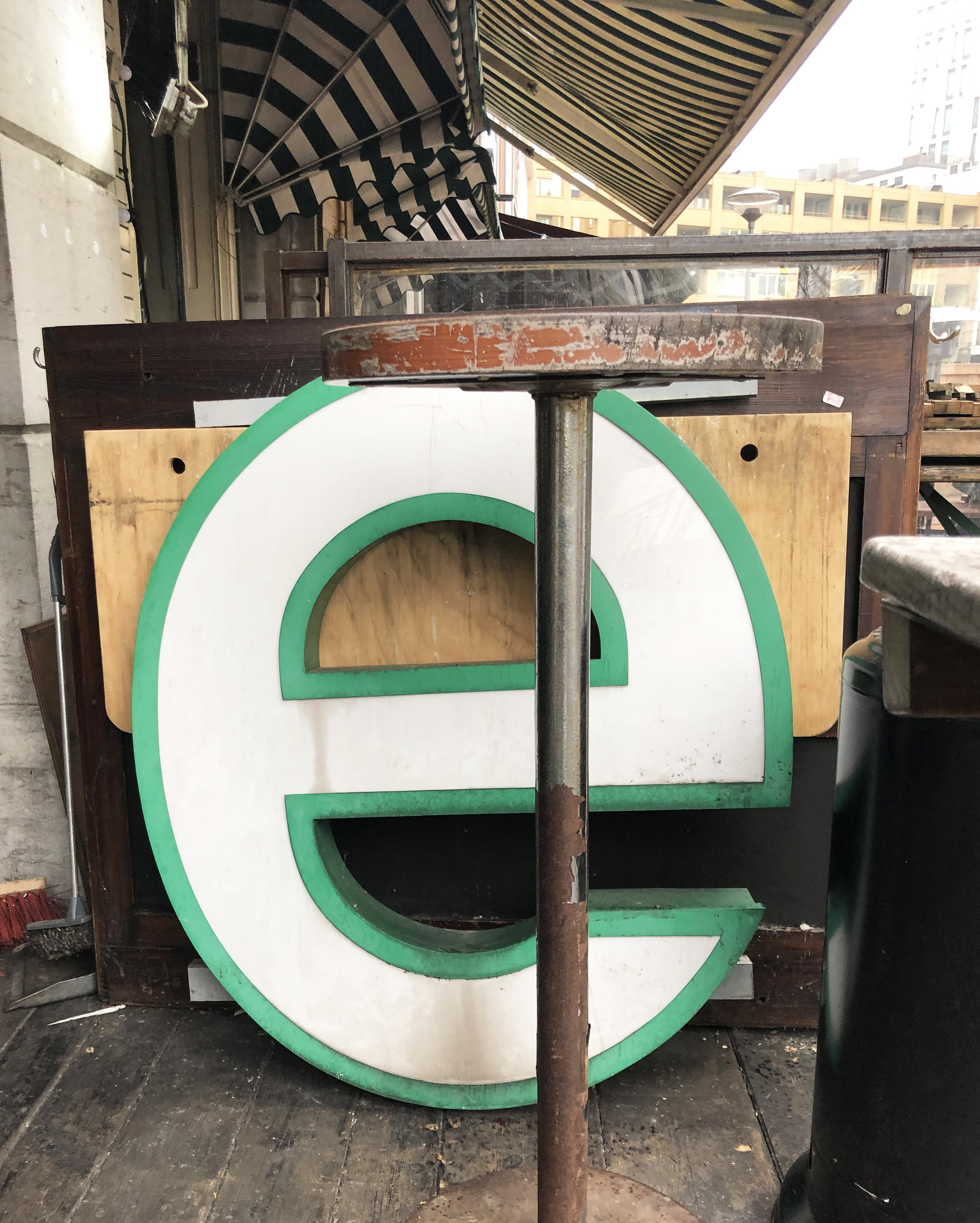
The different impact of letters
She cites the height of the middle bar of the letter “E” as an example. If the middle bar is raised, it is a reference to Art Deco design of the 1930s.
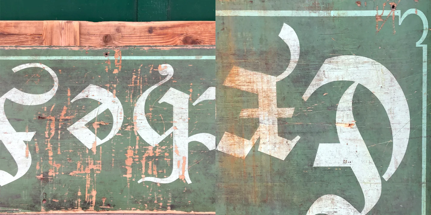
Found upside down type at Naschmarkt, Vienna
In my thirty minute introduction to Scher’s work, I came to understand her design to be driven by the challenge of creating letters that are paired with meaning to create an impact in real life.
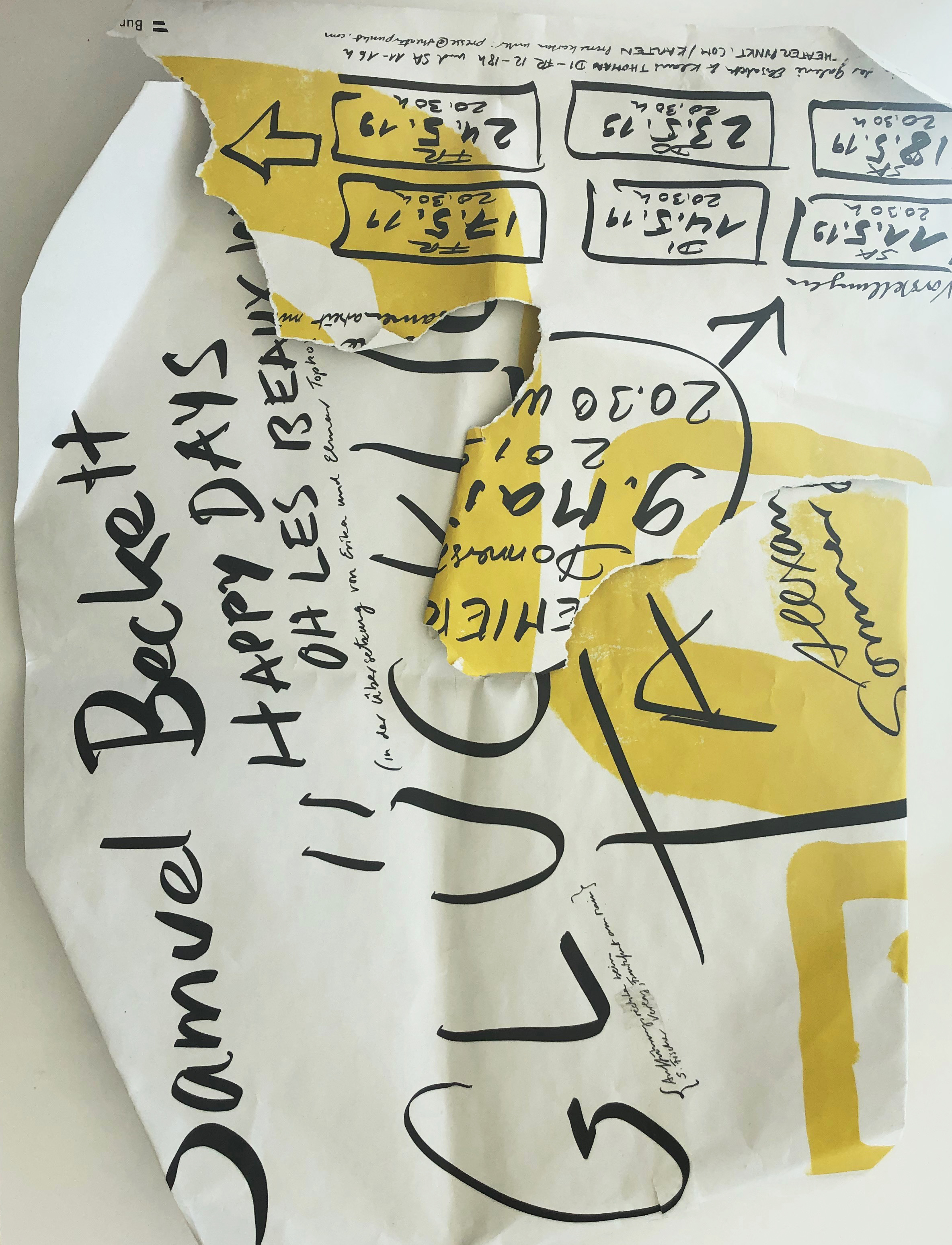
German type
My challenge with the letters that I find in real life places like Vienna, Paris, Rotterdam or Tel Aviv, is that I cannot read German, Hebrew or Dutch and unfortunately my French comprehension is so minimal, that I am nervous about my final exam.


This means more times than not, I am relying on the quality of design to provide information regardless of my language barrier. Out of necessity, I am studying font for it’s characteristics. I pick up advertisements and stop to take a photograph for the same reason. I respond to which type talks to me in my visual language.
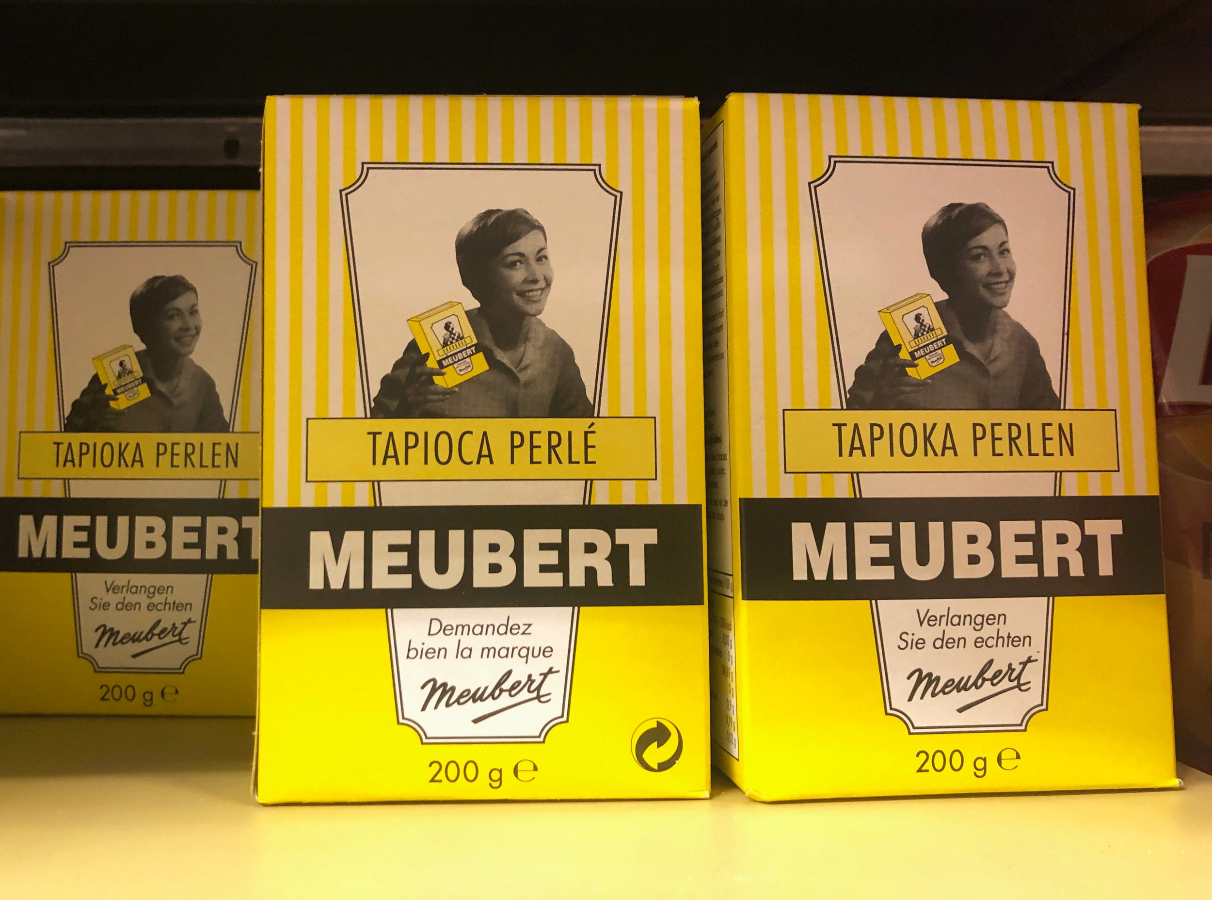

Take the company Meubert for example. I am drawn to their retro packaging, yet it gives me no clues as to what the product is.
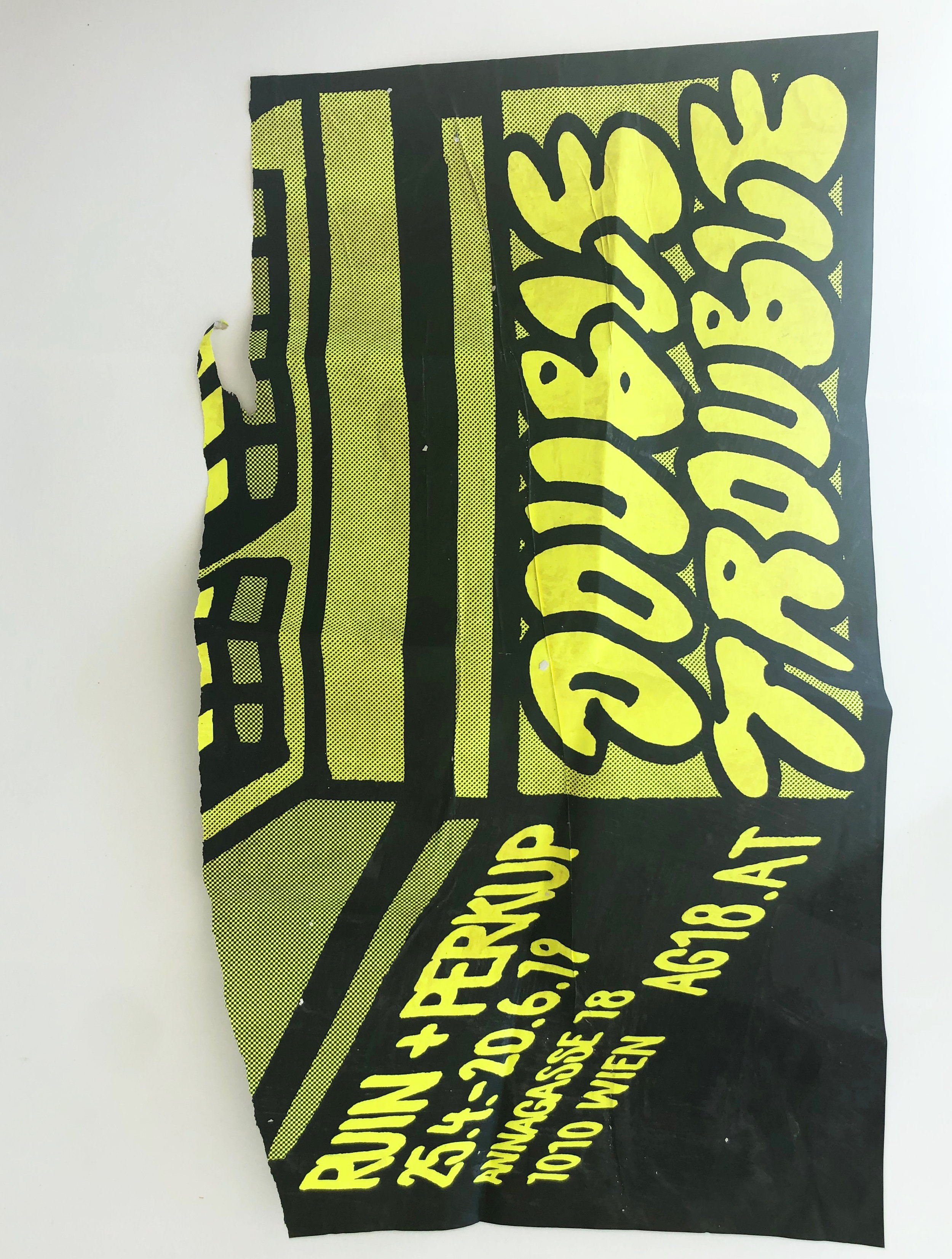
Comparisons
Most of the time it is a shape or form, sometimes it is color, texture or the latter that catches my attention.
Good design can make me be that weird person that gets stared at for taking a picture of an everyday, seemingly unimportant sign or tearing advertisements off a pole and stuffing them in my bag.
Oddly enough, while I was wondering through Vienna a few months back, already in the midst of collecting found type, I stumbled upon an exhibition at Georg Kargl Fine Arts, focused specifically on typography.
Lutte Poétique by the late Henri Chopin featured a series of abstract works on paper created with type as the primary medium and subject.


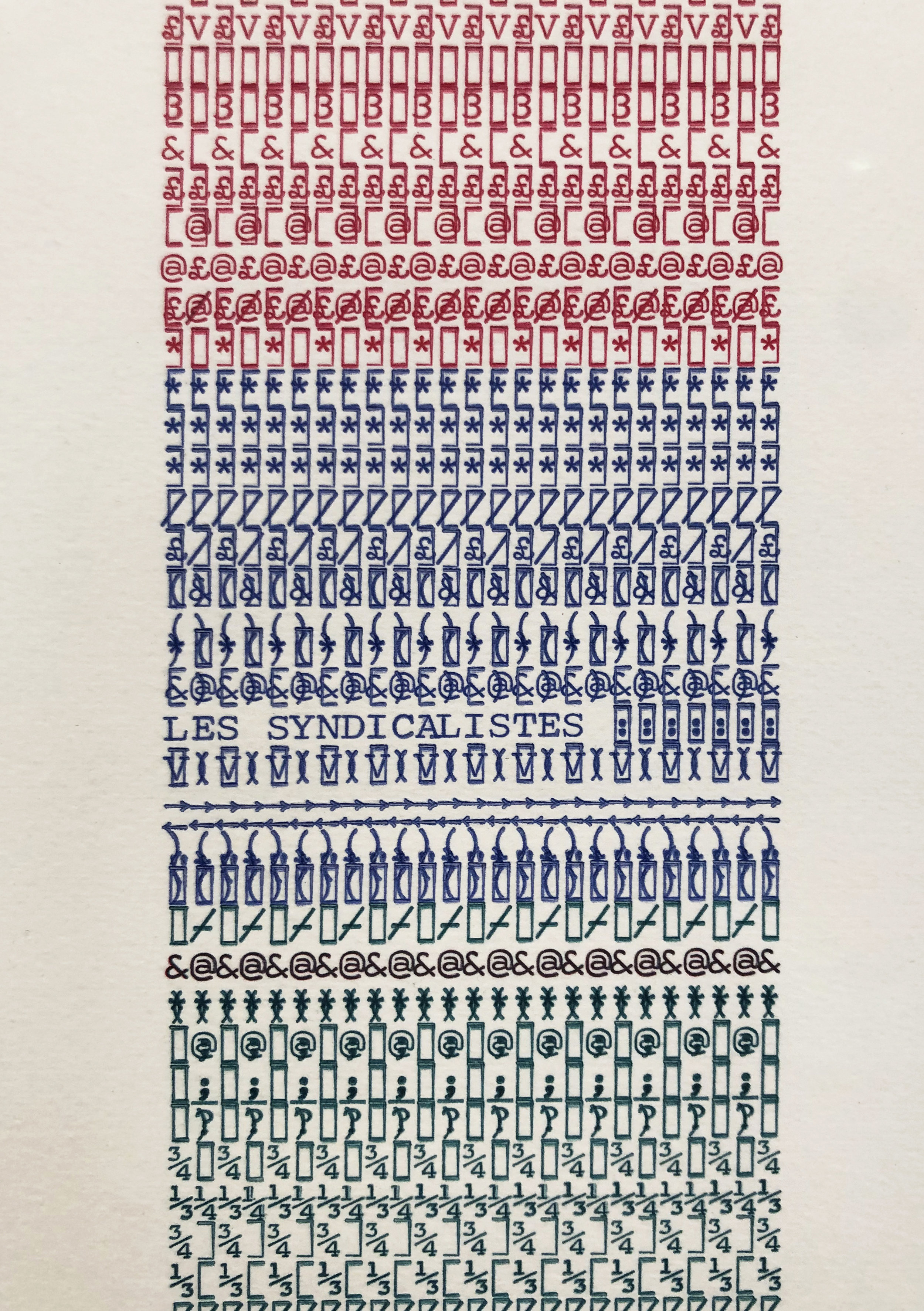


Chopin’s typewritten arrangements use letters, characters and numbers formed in a nonsensical system. When linked together within layers of repetition, they create a different kind of language, legible only in a visual sense.
This is a concept, I have recently been exploring in my own work. As a way to help me process the overwhelming feeling of working through language barriers, I have begun to exploit these emotions by working within a set of limitations that mimic a similar impediment.
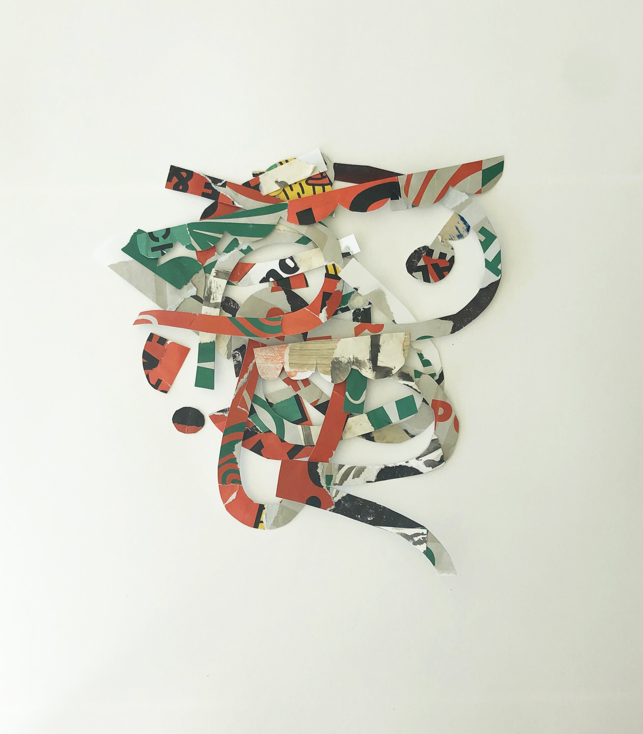


I start by using selected advertisements to construct a collage. Afterwards, I conceal my work from myself by turning it upside down. While the collage is hidden from my view, I cut and crop shapes that I use to assemble new designs.
By creating a “blind collage,” I am withholding information from myself as a challenge to work within the unknown. One result from this process is a two sided accordion book.


Rather than using identifiable text to create abstract imagery, I am rearranging and assembling letters to create new designs that may or may not reveal their original context. It is the history imbedded in each letter’s gesture that I am interested in keeping.
Side 1 of the accordian book
I may not be a painter of words in the same literal sense that Paula Scher created her typographical map paintings, but I use type as an entry point for creating. My paintings are a different type of site specific map.


Currently, my most recent series, “Remnants Dipped in Bleu,” is on view at Bloom Luxembourg from Avril 13 à Juillet 2.